Helping users choose what to learn next

Codecademy is an online learning platform where people come to learn coding and tech skills – through interactive lessons, projects and structured learning paths. With over 50M learners worldwide, it’s one of the largest platforms of its kind.
I was the design lead on the Discovery team, whose goal was to help learners find the content that fits them and get started faster.
Catalog revamp
For most learners, the catalog is the front door to Codecademy – it’s where they browse, compare and decide what to start. Over the years it had grown piece by piece, with new content types and plans each bringing their own patterns, and keeping it clear and consistent was getting harder with every addition.
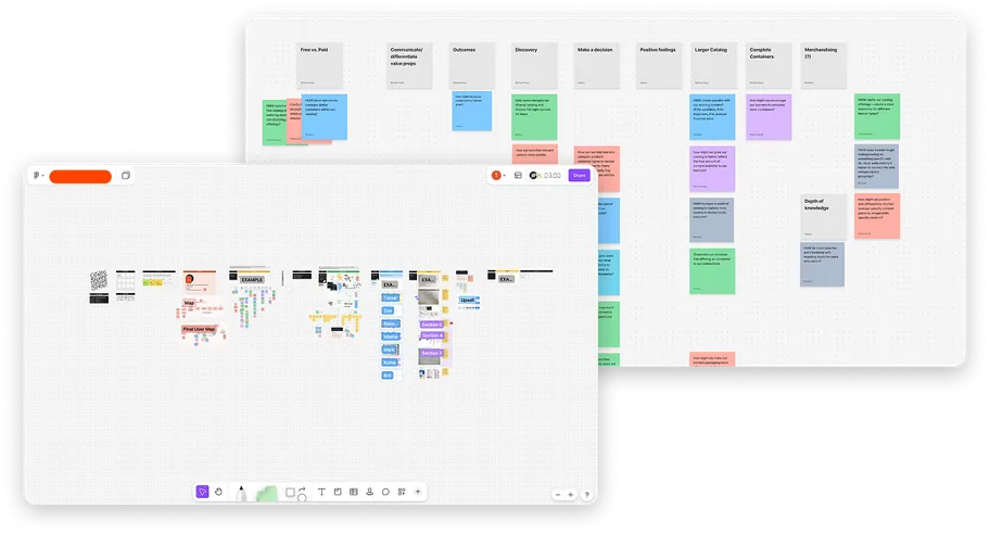
As part of a broader effort to revamp Codecademy’s catalog, I planned and led a design sprint focused on improving discovery and speeding up how we push updates across the catalog. The sprint brought together participants from across the company – engineering, research, data science, curriculum, marketing and more.
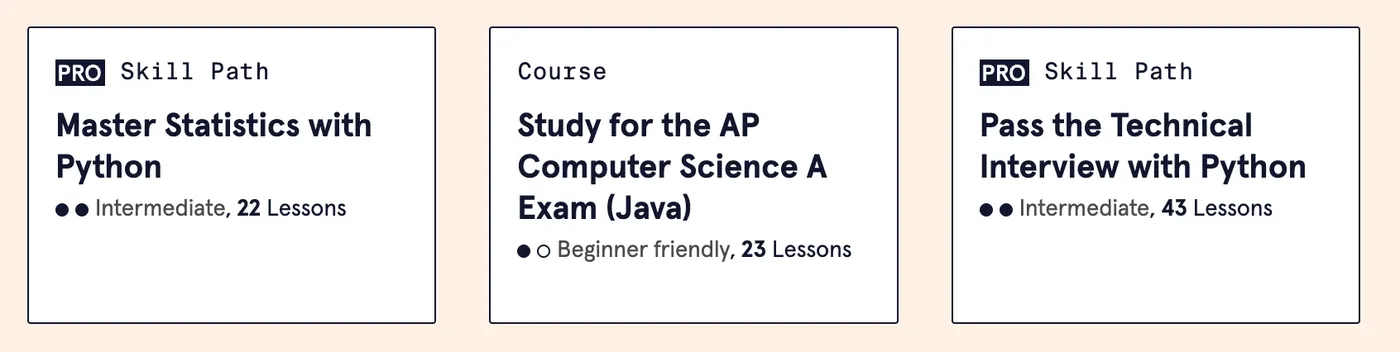
Curriculum cards are the tiles that represent each course, skill path and career path – showing its title, a short description and key details like difficulty and length. Used throughout the platform, they play a key role in how learners find and choose content. One clear outcome of the sprint was identifying curriculum cards as a high-impact opportunity.
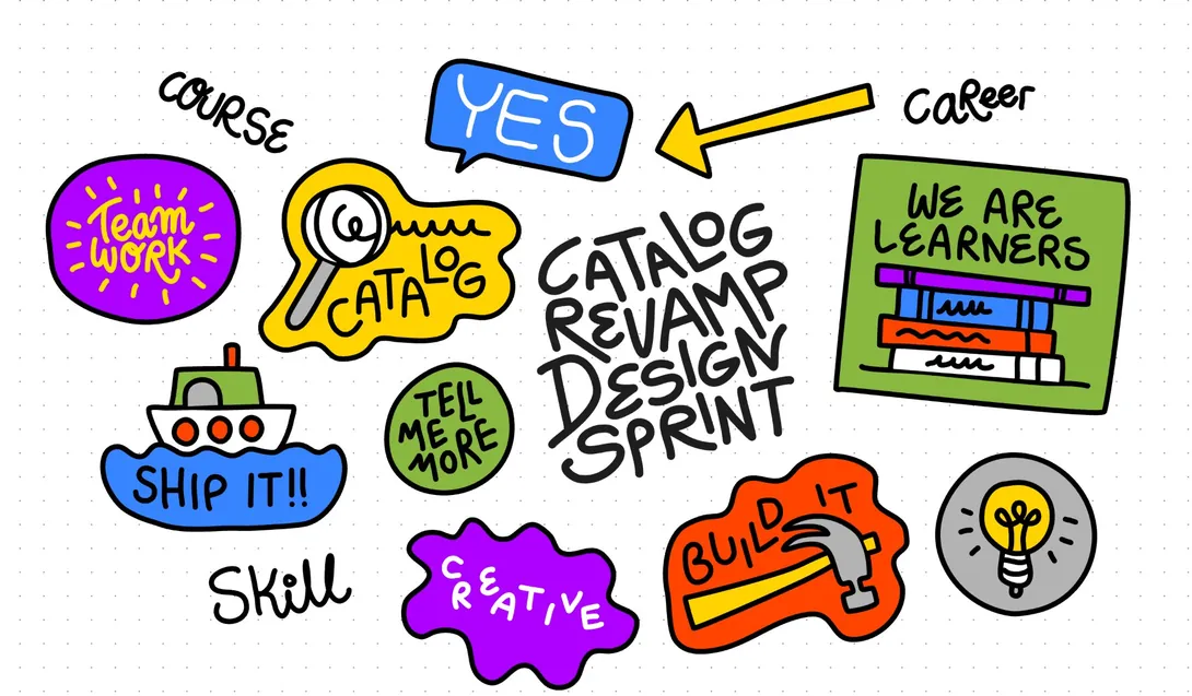
to use during the design sprint sessions
Research-led
This project was an opportunity to step back and design a single system that could work everywhere. We created an audit of all existing cards in the platform, ran surveys and tested prototypes with learners.
We started by mapping every card variation in use – where it appeared, what information it showed, and how it differed across courses, skill paths and career paths. In parallel, we asked learners how they choose what to learn next, and put early prototypes in front of them to see which details they actually read and relied on.
Our research revealed the top attributes learners care about most when choosing content: difficulty level, length and certification.
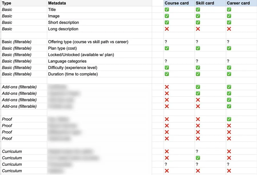
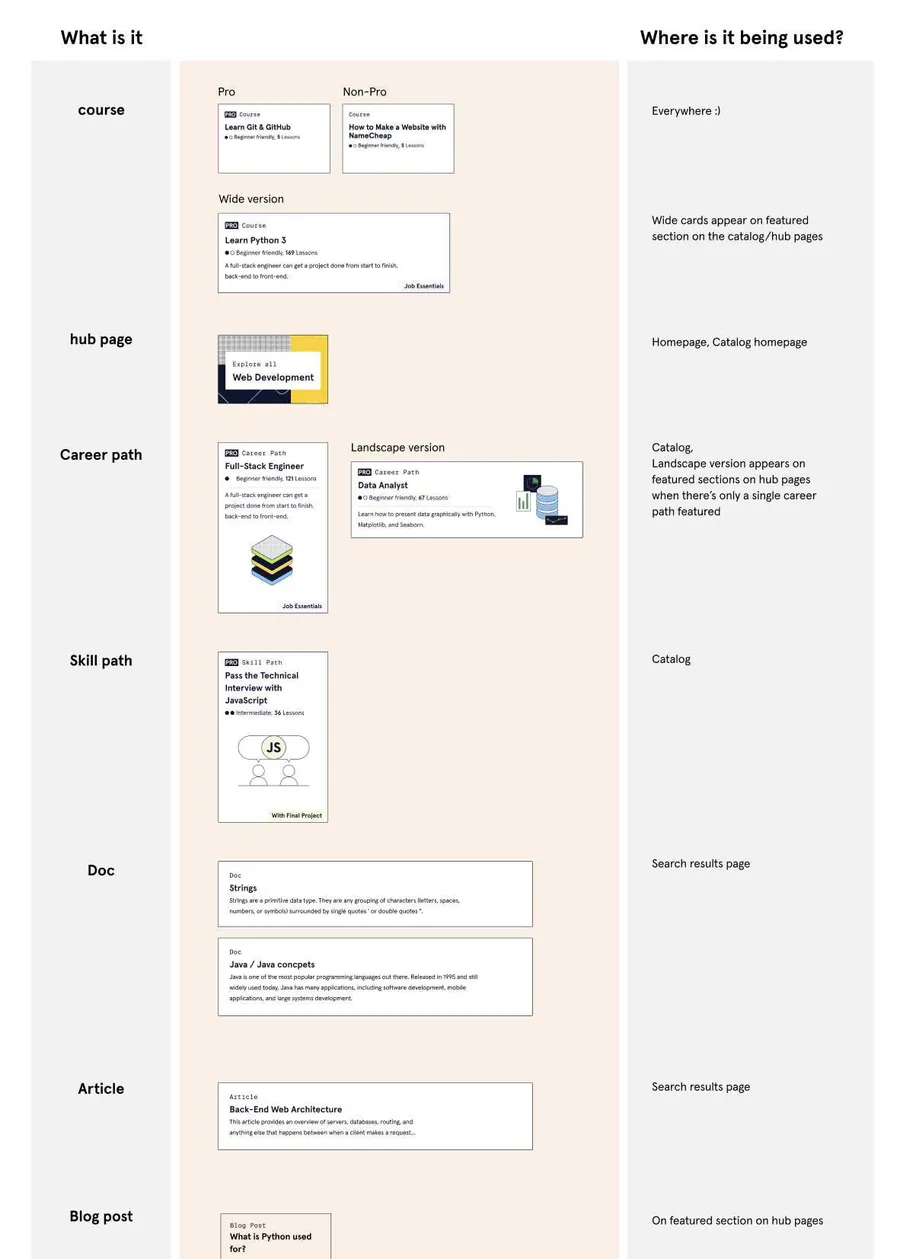
Learners couldn’t confidently choose what to learn next
When we put the card audit side by side with what learners told us in interviews and surveys, the gap was clear. Three pain points emerged:
- 01 Missing enrollment criteria
- 02 Courses and skill paths looked similar
- 03 Unclear paywall
Learners were looking for difficulty level, length and certification to decide what to take, but the cards weren’t showing them consistently – making it harder to scan, compare and decide with confidence.
One card, every content type
After multiple iteration rounds and close collaboration with product, engineering, curriculum and the design systems team, we explored how a single card could flex across every content type – free and pro courses, skill paths and career paths – while keeping difficulty, length and certification easy to find.
This was one of the most fun parts of the project for me. I got to dive into visual design and explore new directions - grounded in our existing design system style guide – while looking for a smart, clean solution that worked within all the technical constraints and across many types of content and data.
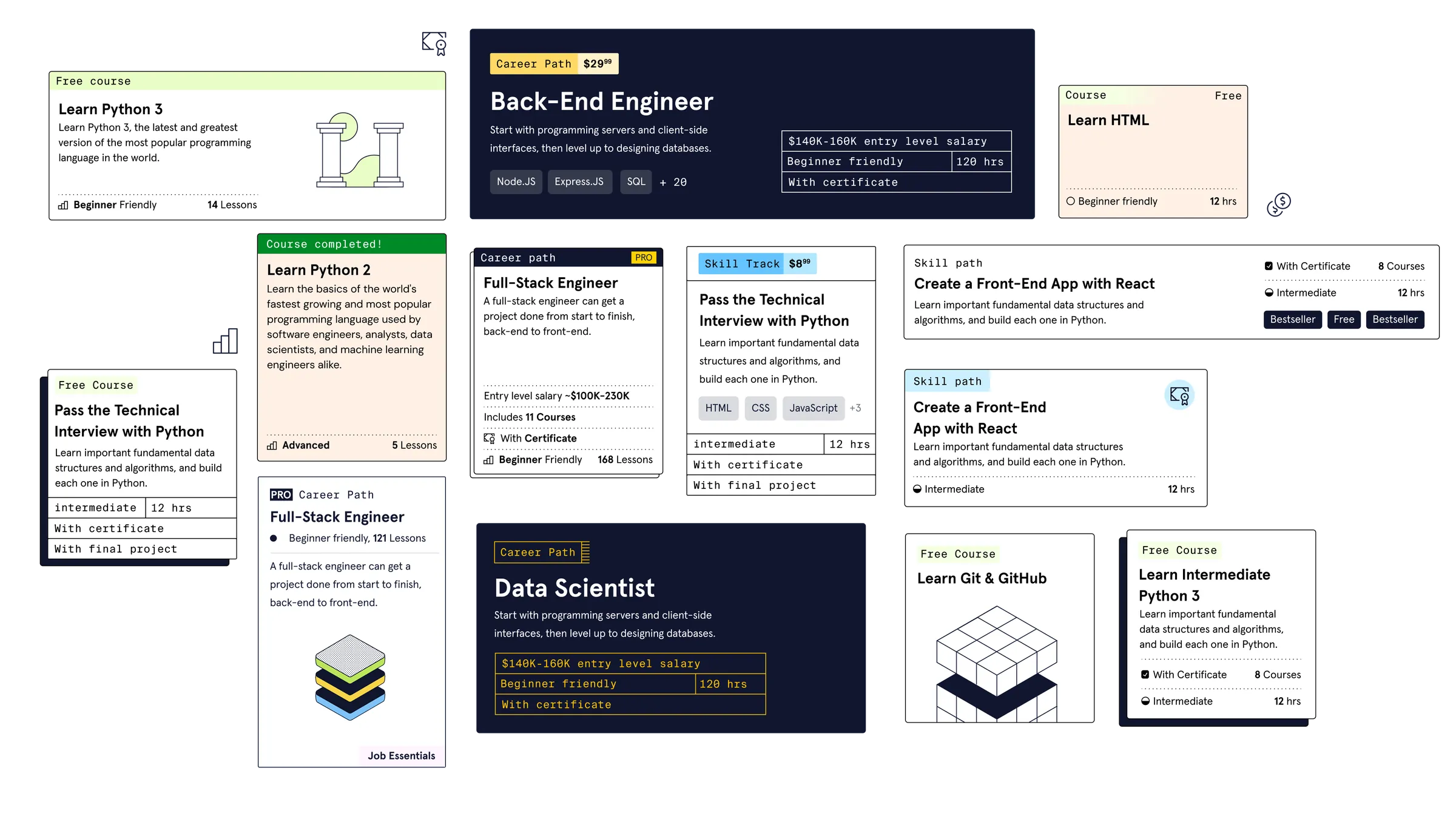
Base card component
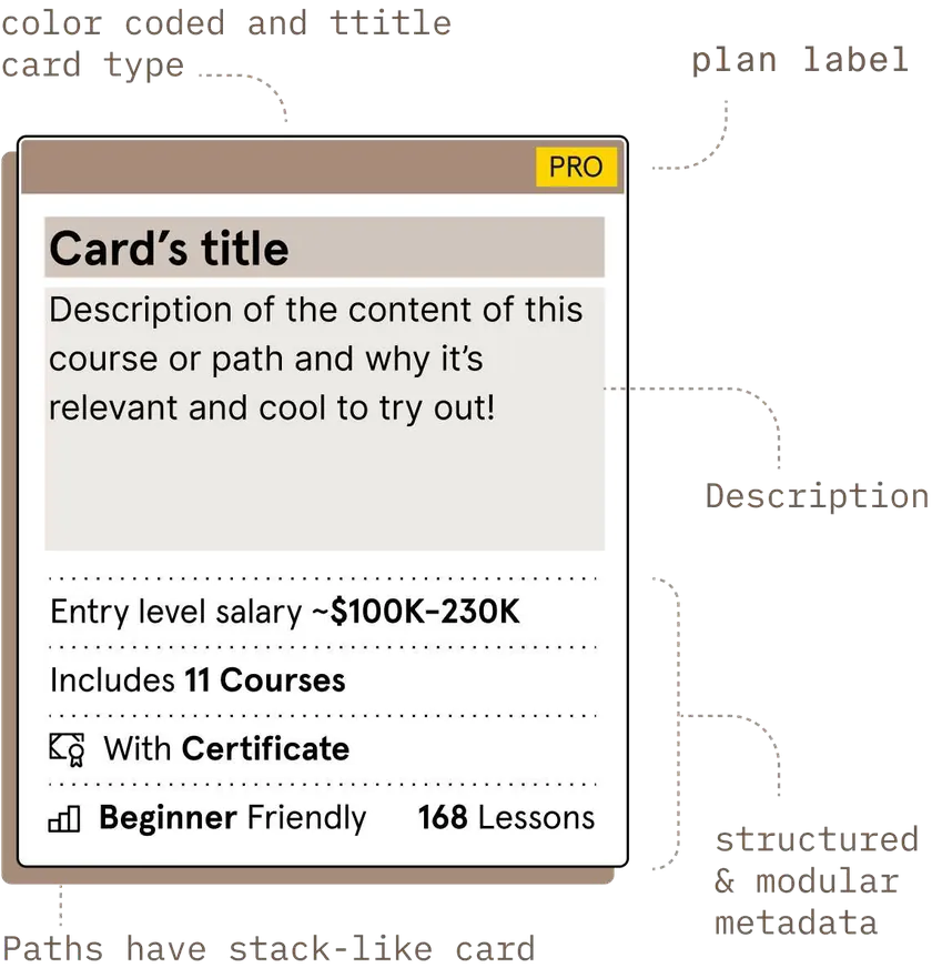
The result was a single base card that every content type is built from. Each card opens with its type and plan, so a free course, a pro skill path and a career path read differently before the title is even scanned. Difficulty, length and certification sit in the same place on every card, which makes it easy to compare options side by side.
To help learners differentiate content types at a glance, the final design introduced:
- Clearer hierarchy
- Richer descriptions
- Structured metadata
- Subtle color-coding
One system, everywhere
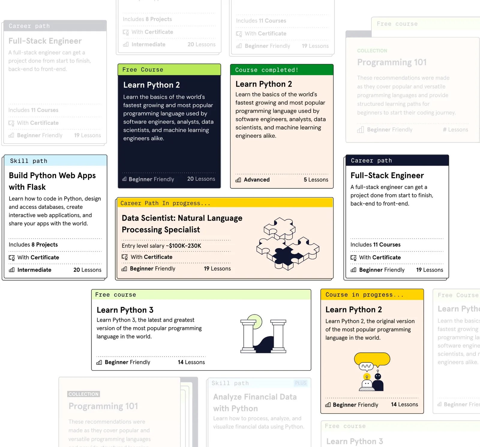
Built as a modular, multi-state component, the cards adapted seamlessly across the platform – and were integrated as a core component in the design system. The same base card covers free and pro courses, skill paths and career paths, and shifts between states like in progress and completed as a learner moves through the content.
Designed for scale, still in use today
The new cards drove more learners from the catalog into courses and through to signup. After launch, we saw increases in enrollment in career and skill paths, visits to Paths landing pages, signups and code submits.
- Enrollment in career & skill paths
- ↑
- Visits to Paths landing pages
- ↑
- Signups
- ↑
- Code submits
- ↑
Another big win was long-term – the card system became a foundational component, used consistently in variations across the site, giving the team a scalable base to keep building on.
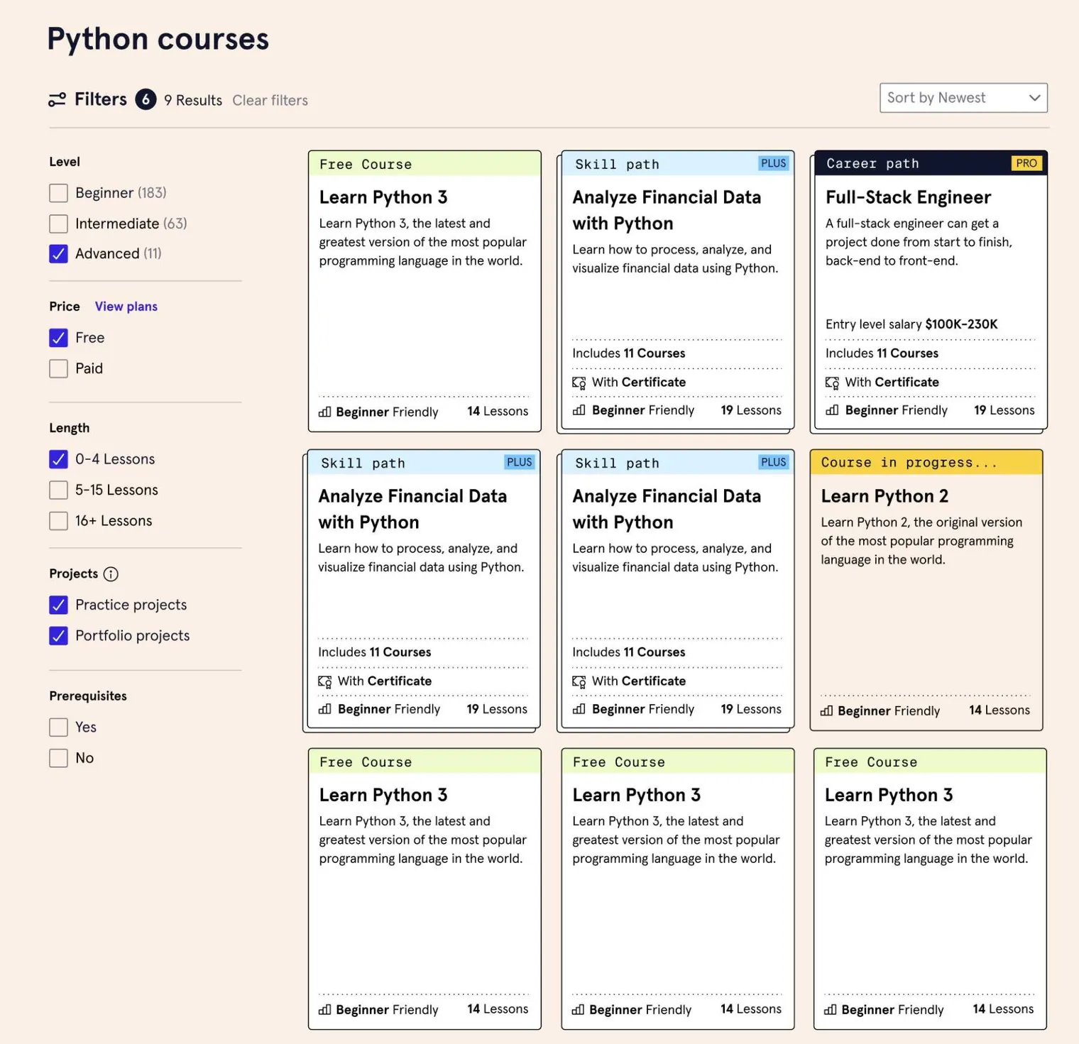
See it live in the Codecademy catalog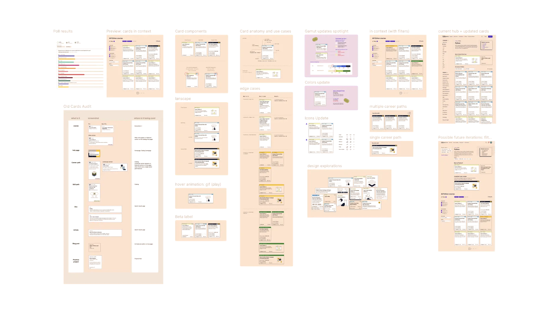
There’s more behind this project than fits on a page – how we collaborated with other teams, the trade-offs we weighed, and the team context and initiatives around it. Happy to walk you through it. Get in touch →